Rebranding of our logo
TD Baltic started its rebranding in 2019. Since the logo is the most visible part of the company, it is vital to have a logo representing its current values.
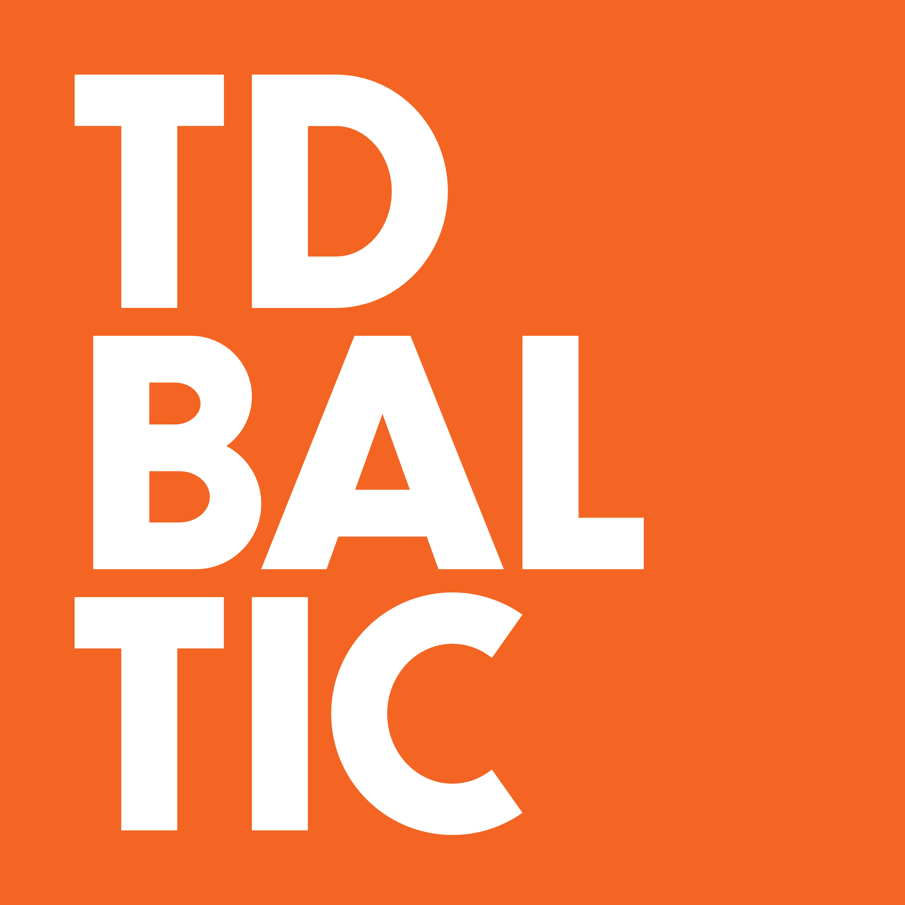
The square logo represents us as distributors. Square boxes are used heavily in the distribution industry, that’s why it appears as a primary symbol in our logo.

Letters in our logo are arranged in three lines because the three Baltic States in which we operate, Lithuania, Latvia, and Estonia, are also aligned in three lines on the map.

Orange, as a primary color, is used as a tribute to our previous logo, which we replaced in 2019.