Logo
Overview
TD Baltic started its rebranding in 2019. Since the logo is the most visible part of the company, it is important to have a logo that represents the company's current values.
TD Baltic logo uses only three simple but powerful visual elements: Square, Letters, and Color. Each of these elements has a significant meaning and symbolism to us.
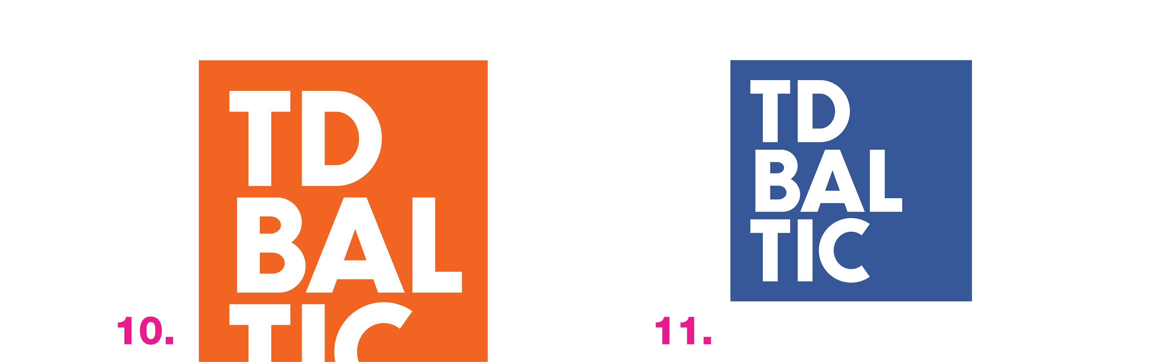
Primary and Secondary logo
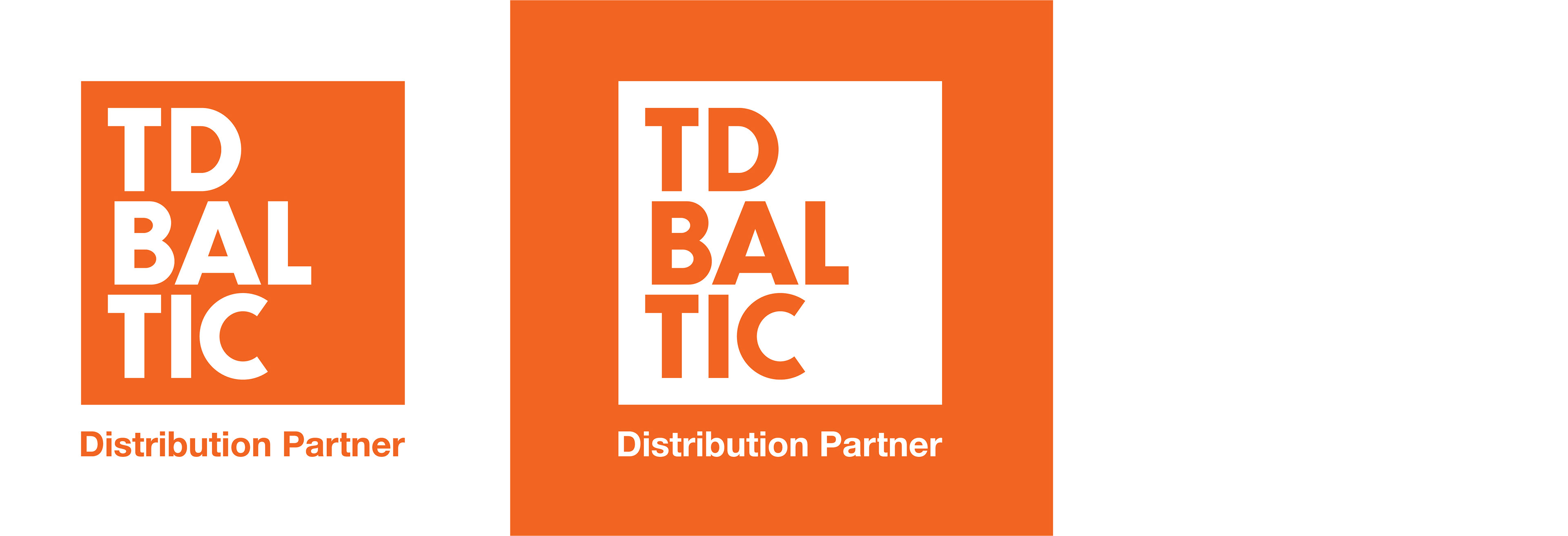
The logo which uses White Letters in Orange Square is our primary logo and should be used in every possible scenario.
If it’s impossible to use our primary logo, a transparent logo should be used. In this logo variation, white square and transparent letters should be used.
If it’s impossible to use our primary logo, a transparent logo should be used. In this logo variation, white square and transparent letters should be used.

Collaborative Logo
A collaborative version of our logo consists of the same visual elements as our primary and secondary logos. The only difference is the phrase Distribution partner. A collaborative logo indicates the relationship between our partner and us, where the partner is the dominant brand, and the TD Baltic is a supportive brand.
This specific version of our logo is also used when end-users and B2C market segments are the primary target audience of the marketing activity and may not be familiar enough with the primary TD Baltic logo.
Before using the collaborative TD Baltic logo, please contact our Marketing Team.
Clear Space
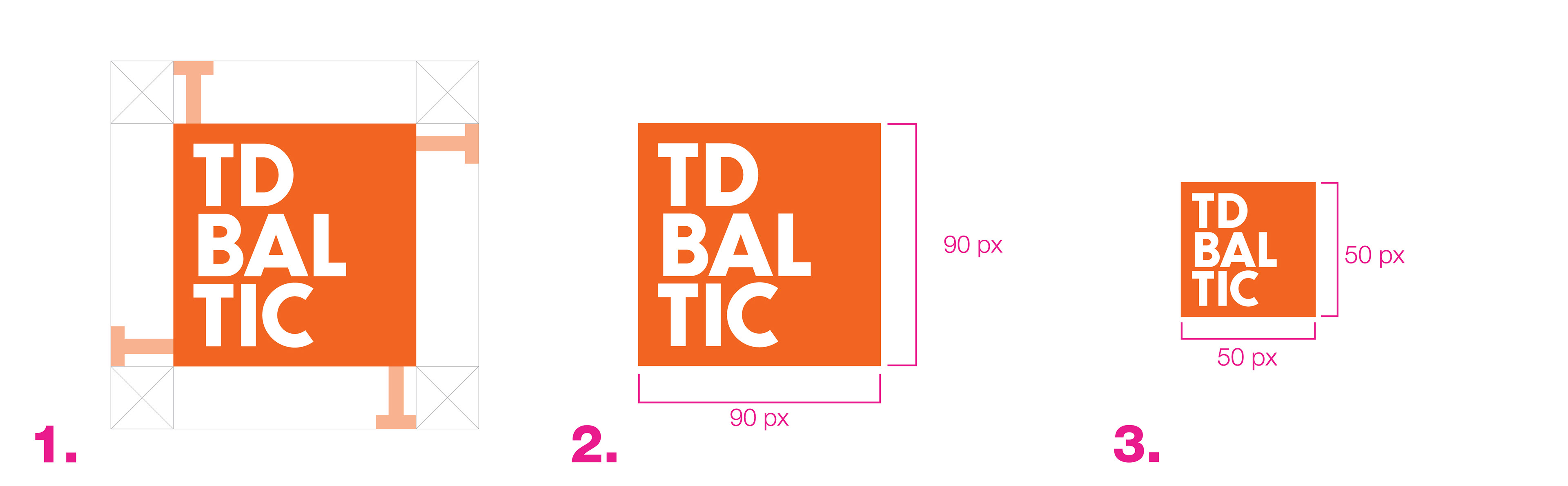
1. Clear space around our logo distinguishes it from other visual elements and lets it stand out. Space of proportional size of the letter T from our logo should be left for our logo to breathe. Clear space should be kept from borders, visual marks, all graphic elements.
2. Standard and recommended use for banners, campaign headers, and other digital use is 90x90 pixels.
3. In cases when a standard size logo cannot be used, use the smaller version of our logo. The minimal size that is available for use is 50x50 pixels.
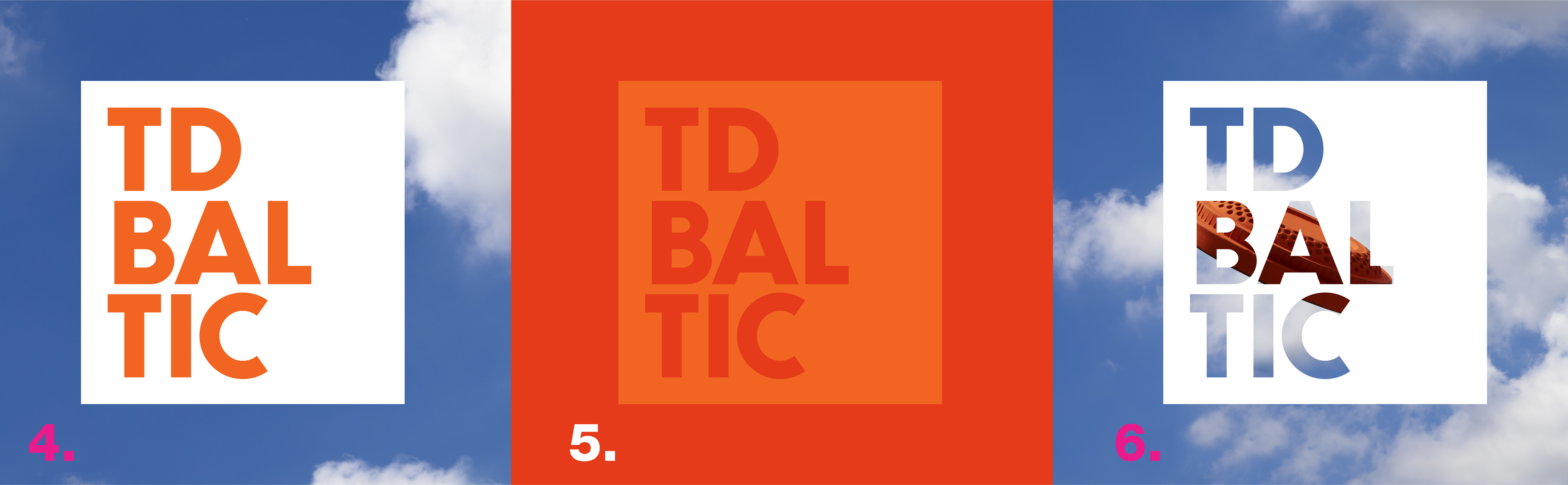
Do's
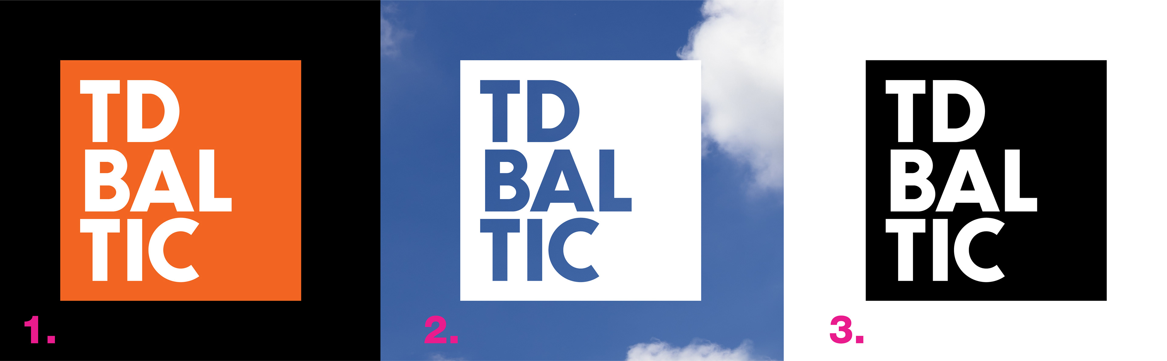
1. Use our primary logo – White Letters on Orange Square.
2. Use transparent logo – Transparent Letters on the White Square.
3. Use the Black and White version of our logo only for prints when the colored print is unavailable.
Don'ts
4. Fill the letters with any color when using the transparent logo version.
5. Use the color logo on a background that overshades the logo. High contrast color background that lets the logo stand out must be used
6. Fill the letters with any graphic elements. Letters of our logo must be transparent and don't include any visual details inside.
7. - 8. Use a logo that is stretched asymmetrically.
9. Use a logo in which different graphic elements are scaled differently. All visual elements should be scaled-up or scaled-down in conjunction.
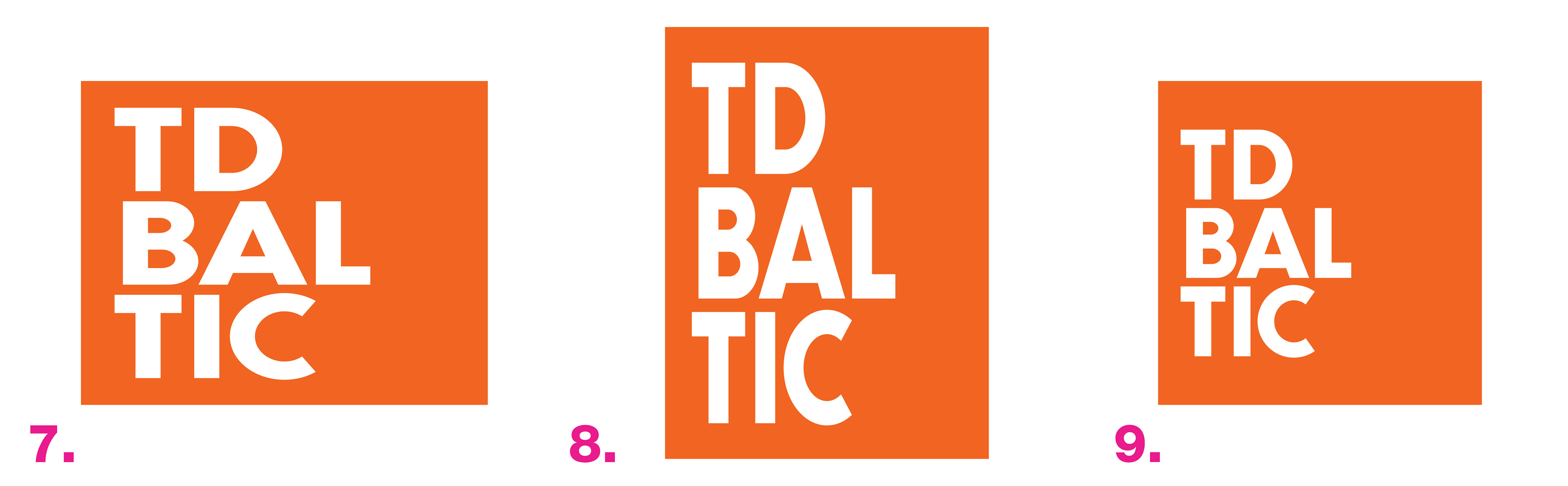
10. Use a logo that is cropped incorrectly and doesn't meet our clear space rules.
11. Use a logo with different, not primary or secondary, TD Baltic colors.
If there's a need to use a logo not covered in this section, please get in touch with our Marketing Team.