
Color Palette
Overview
TD Baltic color palette adds depth and uniqueness to our identity. The Color palette ranges from more calm and formal colors to energetic and enthusiastic tones that encourage confidence and passion.
Primary colors
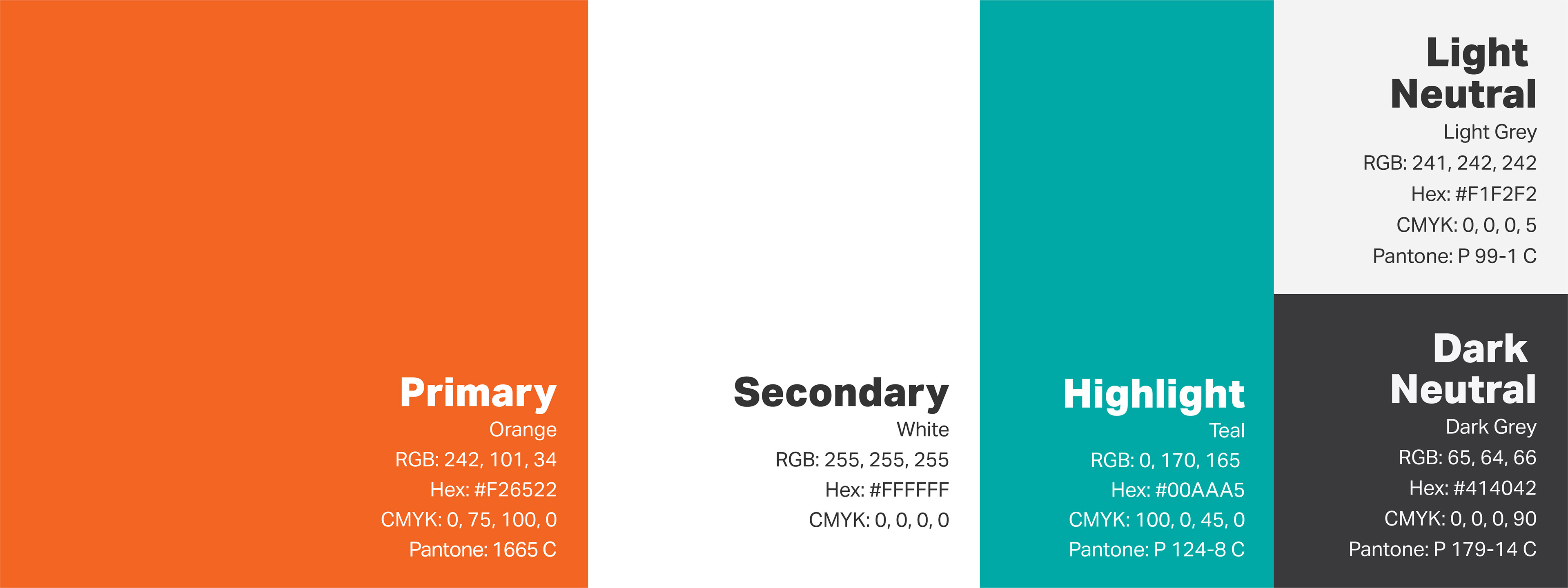
Our primary color palette consists of TD Baltic Orange and White.
TD Baltic orange represents core values that shape our company: innovation, passion, enthusiasm. It encourages communication – an essential principle to TD Baltic. This combination of primary colors should be used in every communication wherever possible.
Primary
Orange
RGB: 241, 101, 34
Hex: #F26522
CMYK: 0, 75, 100, 0
Pantone: P 34-8 C
Secondary
White
RGB: 255, 255, 255
Hex: #FFFFFF
CMYK: 0, 0, 0, 0
Secondary colors
Our palette of secondary colors is made of three colors: Teal, Light Grey, and Dark Grey.
The secondary color palette is made of colors that contrast nicely with our primary colors. The contrast of primary and secondary colors allows our logo to stand out in every scenario. Secondary color palette lets our logo be more diverse and suitable in different situations.
Note that precise color specifications must be used to maintain consistency across media and different communication channels.
Note that precise color specifications must be used to maintain consistency across media and different communication channels.
Highlight
Teal
RGB: 0, 170, 165
Hex: #00AAA5
CMYK: 100, 0, 45, 0
Pantone: P 124-8 C
Light Neutral Dark Neutral
Light Grey Dark Grey
RGB: 241, 242, 242 RGB: 65, 64, 66
Hex: #F1F2F2 Hex: #414042
CMYK: 0, 0, 0, 5 CMYK: 0, 0, 0, 90
Pantone: P 99-1 C Pantone: P 179-14 C